


April 1, 2025 |
On the cover of Renaissance, Beyoncé sits astride a transparent horse that glows from the inside. Turning to face us, she looks defiant, powerful. She wears a revealing, jewelled, silver bodice with spikes that contrast with her smooth, glossy skin, as her stilettoed feet rest upon an iridescent stirrup.
The image brought comparisons to 11th-century noblewoman Lady Godiva, who was said to have ridden naked on a horse as a form of protest against her husband. Shot by Dutch fashion photographer Carlijn Jacobs, 33, Beyoncé said she intended the album would “create a safe place, a place without judgment. A place to be free of perfectionism and overthinking. A place to scream, release, feel freedom.” Released in 2022 into a world still reeling from the pandemic and the Black Lives Matter protests, Renaissance became a cultural signifier of the times.

Beyoncé’s ‘Renaissance’ (2022) cover, shot by Carlijn Jacobs
Today musicians, their record labels and management take exacting control over album artwork. It says so much about artists’ frame of mind, their interests when creating music and how they want the project to be received. When The Rolling Stones released Beggars Banquet in 1968, the cover featured a photograph by Barry Feinstein of a filthy toilet with graffiti on the wall, playing into their bad boy image. It was blocked by the label and replaced with a simple beige cover of the band’s name and the album title. In its review, Time declared that the band were “England’s most subversive roisterers since Fagin’s gang in Oliver Twist”.
Creating unique artwork for albums hadn’t always been done – until 1938, records were shrouded in plain brown paper or cardboard sleeves. Graphic designer Alex Steinweiss was the first to come up with the idea while he was the art director at Columbia Records. As a result, sales rose dramatically.
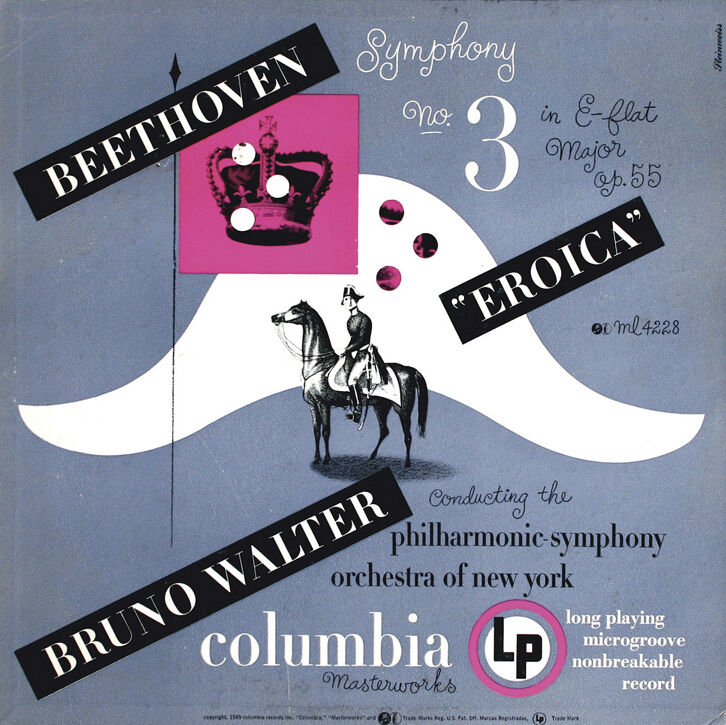

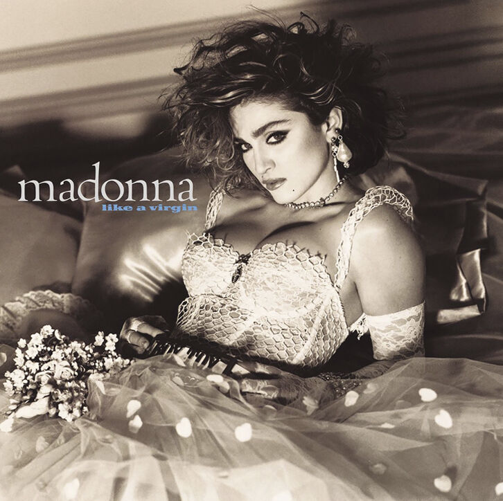
from left: the sales of Beethoven’s ‘Eroica’ (1949) increased by 895 per cent after its sleeve was released; The Beatles used a brilliant-white artwork by pop artist Richard Hamilton for the cover of the ‘White Album’; Madonna posed for the ‘Like a Virgin’ (1984) wearing a wedding dress.
Newsweek reported that adding a cover to a recording of Beethoven’s Eroica in 1941 caused it to sell 895 per cent more than its release in plain packaging. In its infancy, Steinweiss’s work on record sleeves was unburdened by meddling artists and marketing departments, as it was such a new format they didn’t have strong opinions, so he often used the space to make a statement. For the Columbia blues compilation Boogie Woogie, released in 1942, he painted two oversized hands playing a tiny piano, one black, one white, a comment on how racial segregation was still tolerated. By the end of the Second World War, cover artwork had become an important cultural expression, a space to signal to fans who you were and what you and your music choices symbolised.

Andy Warhol created the ‘banana’ cover for ‘The Velvet Underground & Nico’ (1967)
To achieve an association with the zeitgeist in the 1960s, bands commissioned contemporary artists to reflect their vision. In 1968, The Beatles released a self-titled record, known as the White Album. The cover was a brilliant-white artwork by Richard Hamilton. It simply said The BEATLES. In 1956, Hamilton’s collage Just what is it that makes today’s homes so different, so appealing? was considered one of the earliest examples of pop art, a movement that went on to define the Swinging Sixties generation. Hamilton called it “Popular (designed for a mass audience), Transient (short-term solution), Expendable (easily forgotten), Low cost, Mass-produced, Young (aimed at youth), Witty, Sexy, Gimmicky, Glamorous, Big business.” The year before, Andy Warhol had created the cover for The Velvet Underground & Nico. Early versions featured a vinyl sticker of a banana on a white background with instructions in a small typeface telling purchasers to “Peel slowly and see”. Under the banana sat the artist’s name, not the name of the band, reinforcing their association with Warhol’s Factory and hard-edged queer culture. Lou Reed later commented, “The banana actually made it into an erotic art show.”
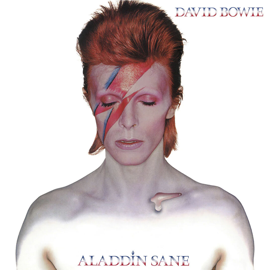

from left: Bowie’s ‘Aladdin Sane’ (1973) album cover, shot by Brian Duffy; the Sex Pistols’ ‘Never Mind the Bollocks’ cover was created by visual artist Jamie Reid in 1977
Some artists use their covers to document transformations – the way they dress, their changing hair and make-up – by giving a sense of the character they inhabited while making the music. David Bowie only appeared as the Aladdin Sane character once, on the cover of his 1973 album of that name. It was a response to his newfound fame and the madness that came with it, a darker, more cynical version of the previous year’s Ziggy Stardust, but it became a visually iconic encapsulation of how a musician can capture an idea through their appearance. He said, “There was a point in ’73 where I knew it was all over. I didn’t want to be trapped in this Ziggy character all my life. And I guess what I was doing on Aladdin Sane, I was trying to move into the next area.” The image, captured by Brian Duffy, shows Bowie shirtless, with a red-blue lightning bolt painted across his right eye, a shock of red hair and a ‘tear’ resting on his collarbone. It has been appropriated time and again, notably by British Vogue, when Kate Moss, shot by Nick Knight, appeared as the character on the magazine’s cover in 2003, though her bolt was applied in post.

Jean-Paul Goude’s painted photograph of Grace Jones for 1981’s ‘Nightclubbing’
Madonna, a Bowie superfan, has also used transformation as a device, and from cover to cover she has appeared as different characters: cowgirl (Music), earth mother (Ray of Light), disco dancer (Confessions on a Dance Floor), religious/political figure (Like a Prayer, Madame X, American Life), sex siren (take your pick: True Blue, Erotica, Like a Virgin, Hard Candy, Bedtime Stories). In 1984, on the cover of Like a Virgin, she posed for an image by Steven Meisel wearing a wedding dress, the “Like a” implying that this was an act. Madonna said that it was a “statement of independence – if you wanna be a virgin, you are welcome. But if you wanna be a whore, it’s your fucking right to be so.”
The collaborative nature of creating an album cover is, in some cases, what is most potent. When Patti Smith and Robert Mapplethorpe met in 1967, they became each other’s muses. He encouraged her to sing and when she released her debut album, Horses, in 1975 he photographed her for the cover in black and white; she leans against a white wall, androgynous and mythic in her suit and draped tie. The image is full of the minimalism of the early punk movement and the underground New York scene that defined Manhattan in the 1970s. A couple of years later Grace Jones met Jean-Paul Goude and they began collaborating on her performances, album art and music videos. For the cover of 1981’s Nightclubbing, Jones, striking a similarly defiant pose to Smith, appears with a flat top haircut, created by Christiaan Houtenbos. In the painted photograph by Goude, she wears an Armani suit jacket that creates angular shoulders. She wears nothing underneath, her skin shimmers, a cigarette dangles from her lips. These statements were incendiary, subversive, and paved new terrain in both the music produced but also in the way women could inhabit the spotlight.

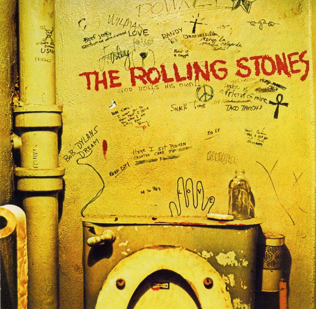
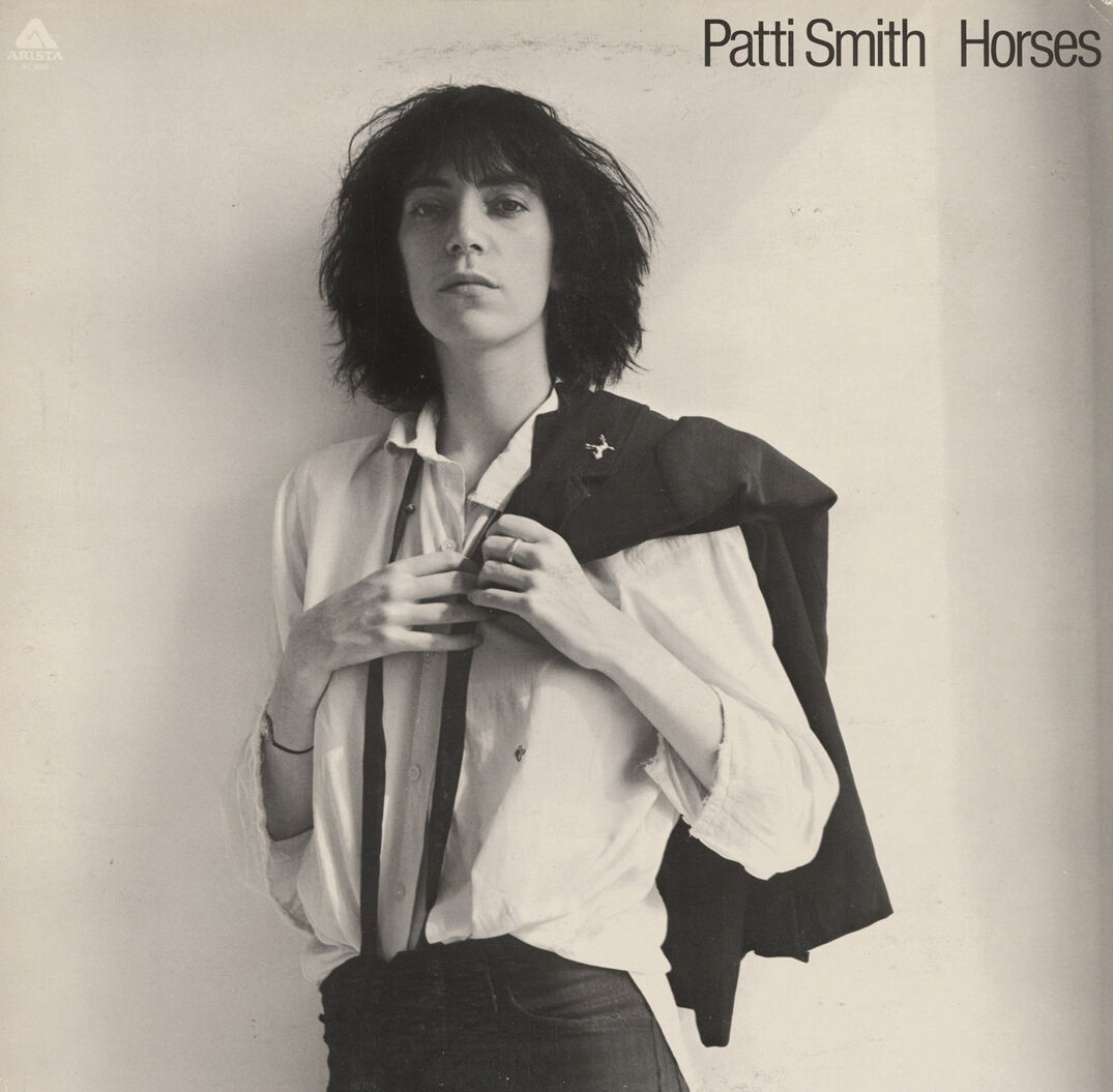
from left: the title, green artwork and songs of Charli xcx’s ‘Brat’ album encapsulated the moment; the cover of The Rolling Stones’ 1968 album ‘Beggars Banquet’ originally featured a photograph by Barry Feinstein of a filthy toilet with graffiti on the wall; Robert Mapplethorpe shot his friend, and former girlfriend, Patti Smith for the cover of ‘Horses’ in 1975;
The album cover has also been a site of more obvious and deliberate controversy. Kanye West wanted George Condo’s artwork for his 2010 album My Beautiful Dark Twisted Fantasy to be offensive enough to be banned by retailers (he claimed it was; Walmart denied this, saying they were “excited” to stock it). When the Sex Pistols burst on to the scene with Never Mind the Bollocks, Here’s the Sex Pistols, released in 1977, the first part of the title, which frontman Johnny Rotten explained was a working-class expression to stop talking rubbish, led to obscenity charges. The cover, with its graphic treatment in pink and yellow, was created by visual artist Jamie Reid. A Virgin Records shop manager in Nottingham was arrested after being warned to cover up the word ‘bollocks’.
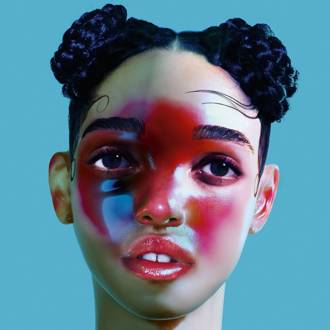
from left: Kurt Cobain was inspired by a documentary on water births for the cover of Nirvana’s ‘Nevermind’ (1991); the cover for FKA twigs’s 2014 album ‘LP1’, created by artist Jesse Kanda
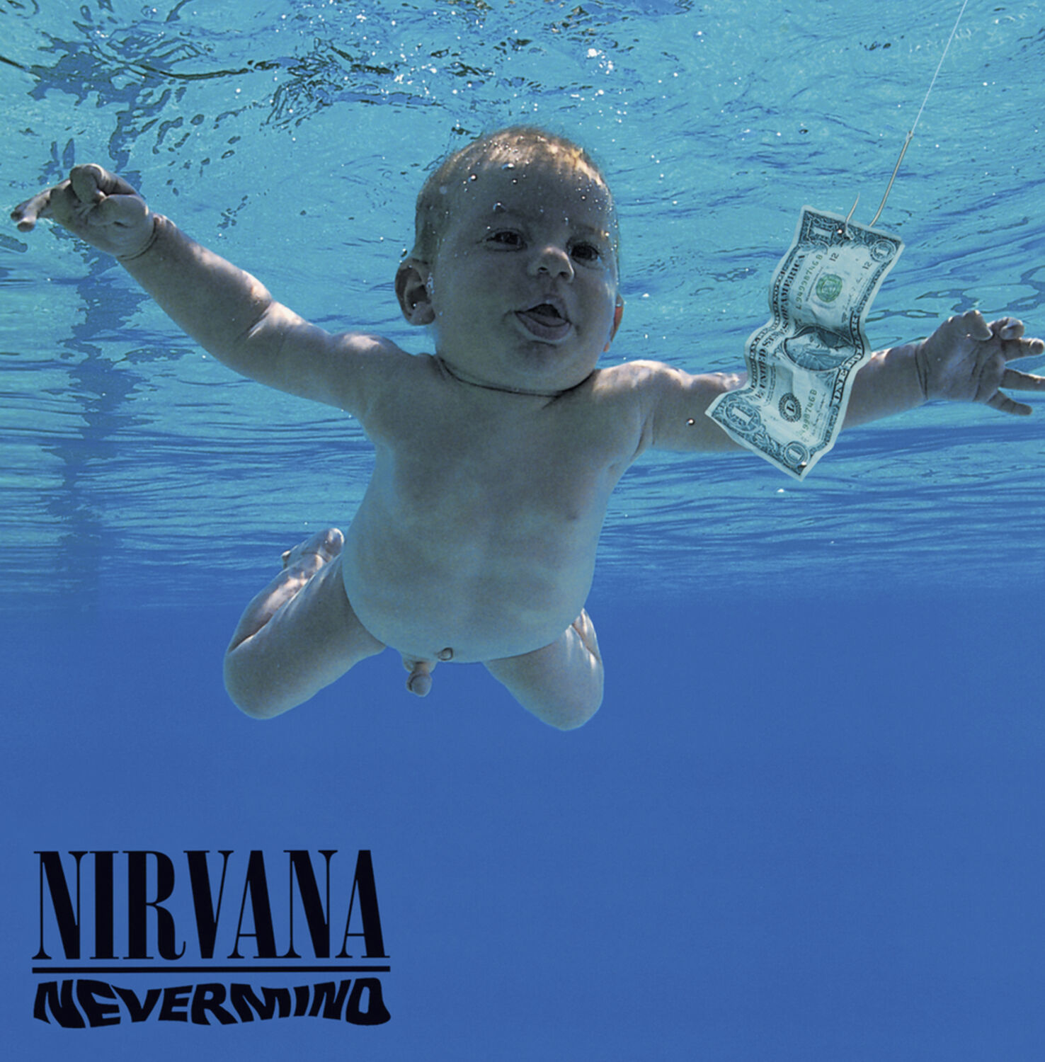
Nirvana had a similar spirit, with their 1991 album Nevermind defining the grunge era of the 1990s. The cover featured a naked baby floating underwater in a swimming pool with a dollar bill just out of reach. The idea came to Kurt Cobain when he was watching a documentary about water births. The creative director of the band’s record label, Geffen, looked into using a water birth image but it was deemed too graphic. Instead, they commissioned the image of the baby boy, though the label was worried about his penis being on view. As a solution, Cobain suggested putting a sticker over it that read: “If you’re offended by this, you must be a closet paedophile.” The record label released the image without a sticker. The controversy continued, however, most recently in 2021 and 2022, when the baby in the image, Spencer Elden, now 34, sued Cobain’s estate, band members Dave Grohl and Krist Novoselic, and the photographer, Kirk Weddle. He stated the photo was created without his consent or that of his legal guardians, that it violated child pornography laws and resulted in “lifelong damages”. A judge ruled against Elden, saying he had waited too long to file charges, with the defendants’ lawyers saying he had “spent three decades profiting from his celebrity as the self-anointed ‘Nirvana Baby’”.

Frank Ocean, who said in a 2012 Tumblr post that his first love was a man, chose Wolfgang Tillmans, whose work has explored gay culture, to shoot his ‘Blonde’ album cover image in 2016 (the cover says ‘Blond’)
What ties all these covers together is that they act as markers for the time they were created. Over the past 10 years there have been seismic changes across the world economically, politically and socially, and both music and cover artwork have reflected this. In 2016, Frank Ocean released Blonde, its cover image shot by Wolfgang Tillmans. The singer appears in a shower room, naked from the chest up, with his hand covering his face, his hair dyed green. In 2012, he wrote a Tumblr post saying, at age 19, his first love was a man; this was a watershed moment for the Black LGBTQ+ community and Tillmans’s work, that has explored gay culture, offered a view of Ocean which was melancholy, intimate and nostalgic. Other artists have explored technological advancements. In 2014, FKA twigs created her cover for her debut album, LP1, with the artist Jesse Kanda, who took photos of her head, sculpted it in 3D and then painted over it. Last year’s Brat, by Charli xcx, showed the word printed in bold black type on a lime-green background and encouraged us all to have a ‘brat summer’, a sentiment spurring a million memes and taken up by the US presidential candidate Kamala Harris. The title of the album, the artwork and the songs all came together to encapsulate and congeal a moment in time.
Although more and more we see artists’ brands being sculpted to appeal to the masses, the images that we keep coming back to have a sense of authenticity, something urgent and meaningful to say. When we gather them together and look at them, it is as if we are transported to a time where we can smell the revolution, the sadness or the joy. Good album covers seize the cultural moment, but great ones transcend it.
Taken from 10 Magazine Issue 74 – MUSIC, TALENT, CREATIVE – on newsstands now. Order your copy here.


