


April 22, 2025 |
“A good album is what makes a good album cover. If that’s one of your questions, that’s the answer. A good album.” I’m on a Zoom call with Peter Saville, perhaps the most influential graphic designer 20th-century Britain has produced, to discuss record sleeves – a topic that’s stalked him for 45 or so years. “I’m weary of going over the same thing, but as time goes by, my contribution takes on a greater significance to me personally, but also because of how times have changed.”
It’s a creative medium that Saville, 69, admits to having lost interest in around 1985 (“Once you get to 30, you have to find a grown-up life”). Yet despite being fatigued by it all, it’s the works that he produced in his early adulthood that have not only become pop-cultural icons, but immortalised his own name as a tastemaker in the process.
The pulsar radio waves on the cover of Joy Division’s 1979 masterpiece, Unknown Pleasures, that congregate in mountain-like peaks or appear like a tapestry of frantic heartbeats, depending how you look at it; the painterly florals of New Order’s second album, Power, Corruption & Lies (1983) and the cherub statue Saville rented from an antique shop and bathed in rave-ready neon for their fifth record, 1989’s Technique. These are works that have remained important artefacts of British music and were revolutionary in their approach to design.
“Everyone tends to refer to good albums having good covers. [The Beatles’] Sgt. Pepper’s is a classic, [Pink Floyd’s] Dark Side of the Moon. Nirvana’s Nevermind with the baby. Almost any cover for a great album becomes iconic, it just does. And you can do really great covers for albums that no one remembers. No one ever mentions them!” Yet thankfully for Saville, this has never been a burden he’s had to bear. The sleeves he’s designed have become record-store fixtures, spawned bedroom-wall posters and have been used to flog countless pieces of pop ephemera (both legit and counterfeit) to music fans globally.
 Wolfgang Stahr")
Peter Saville
When he made the cover for Unknown Pleasures, he hadn’t heard the record and had only seen Joy Division play a handful of times. “It was easy because the band had given me the pulsar image, I just had to figure out what to do with it. I was not yet aware when I was doing it that it was the best album of the new wave to date. Forty-six years later, it’s gone from legendary to historic.”
The works Saville produced nearly half a century ago have a big relevance to his life now, he says, because they were created in a pre-hyper digital age, analogue times where you didn’t have to cut through the drone of infinite scrolling to make a cultural impact.
Growing up, Saville was interested in a world he’d only caught glimpses of. He came from a middle-class family that lived in Hale, a privileged neighbourhood in South Manchester. They didn’t go abroad, but Saville remembers taking trips to go and view the newly built terminal at Manchester Airport. “I remember that a drive out to the airport was a very exciting thing to do,” he says. “Going there was like going to look at the doorway to the world.” As a child, he’d only known about life outside Manchester’s 0161 calling code through the television (he was raised on a diet of Bond movies) and the arrival of The Sunday Times Magazine in glorious colour. “The difference between then and now is immeasurable for somebody, say, age 20 to imagine that The Sunday Times Magazine was like a window to the world.”
He also remembers going down to London aged 10 – “I would complain if I was not taken to Carnaby Street” – and by 15, he was poring over copies of L’Uomo Vogue in his older brother’s bedroom. “And then David Bowie happened.” His first gig was to see the Thin White Duke, then promoting his new single, Space Oddity, open for Humble Pie in October 1969 at the Odeon in central Manchester. “Then when he came back as Ziggy, obviously that was profoundly important. Everybody of a certain generation quotes his famous appearance on Top of the Pops [performing Starman in July 1972]. They all saw the same thing. For some, it profoundly changed their life. Now that was one TV appearance. How many TikTok videos do you need to make that sort of impact? It was like the difference between a desert and a jungle. We were wandering around in the desert.”
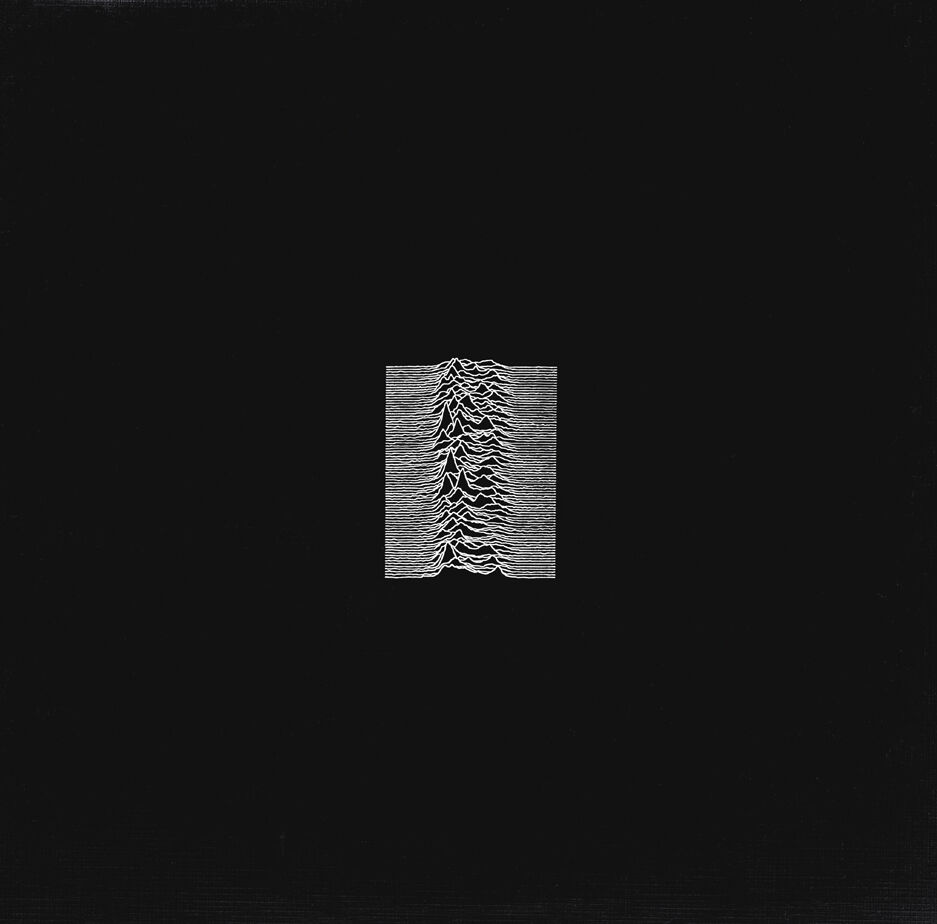
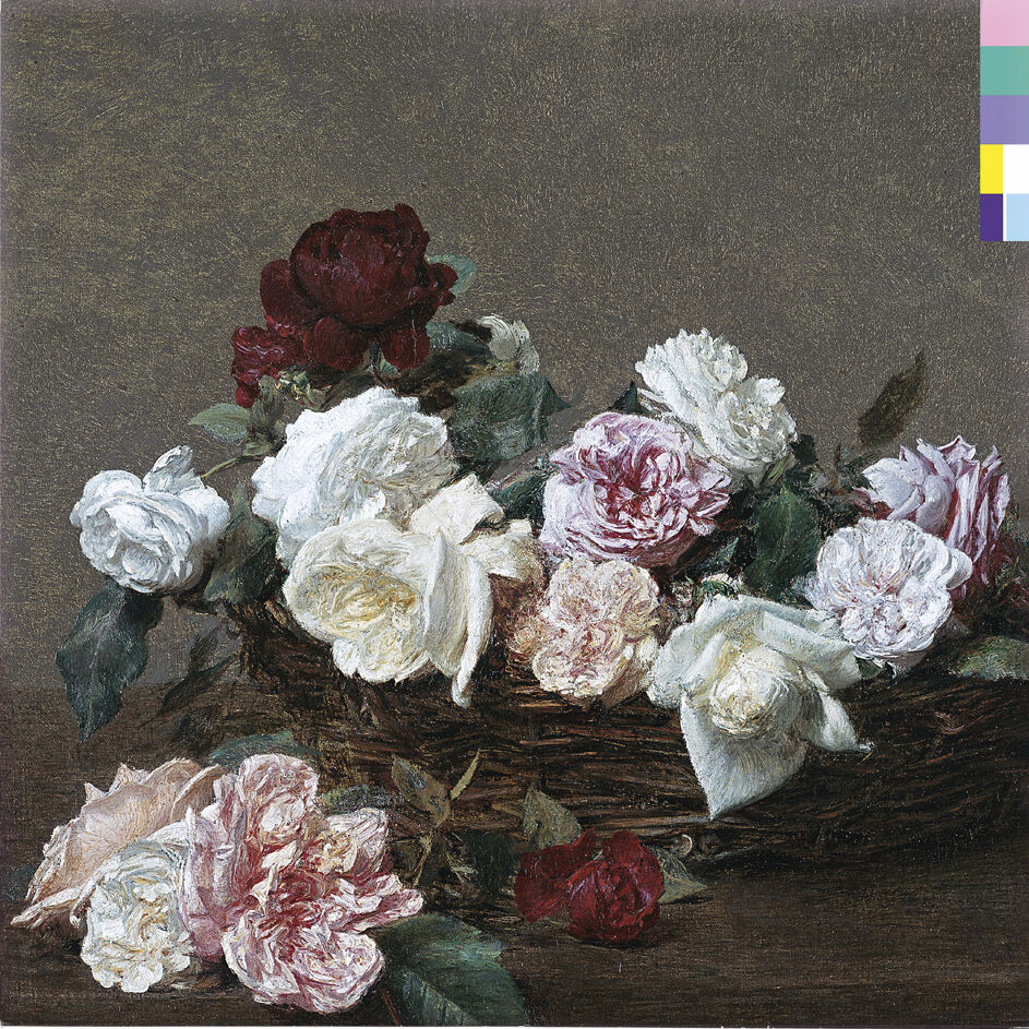
from left: Joy Division’s ‘Unknown Pleasures’ on Factory Records, 1979. Design by Joy Division and Peter Saville. © Joy Division/Peter Saville; ‘A Basket of Roses’ by Henri Fantin-Latour, 1890. Courtesy of the National Gallery, London. © Peter Saville/New Order
Anybody who was interested in the art of pop, he says, knew album covers. “You saw them all. Every time you went to a record store, every time you were turning through the pages of the music press, every time you went around to someone’s house, you looked through their collection. As a teenager in the ’70s, if you were visually interested, you knew record covers. It wasn’t difficult, because there was nothing else to know.”
The UK cover of Kraftwerk’s Autobahn (1974), which features the plain German motorway symbol set against a blue backdrop (as opposed to the painting by Emil Schult on other countries’ releases), had a profound influence on Saville. “It was an introduction to something called semiotics, the language and code of signs, a term that I did not know at the age of 19. When I looked at the autobahn sign I didn’t just see the sign of a motorway then, I saw it as a route across Europe, and therefore the history of Europe, from cathedrals to power stations. I realised all of that world of inspiration could be contained in one monochrome symbol.”
Saville would employ a similar technique for his first design for Factory Records, the seminal label he co-founded with Tony Wilson and Alan Erasmus in 1978. The hazard-yellow “use hearing protection” poster for the first Factory nights at the Russell Club in the rundown area of Hulme – where Joy Division headlined only its fourth concert – saw Saville adapt an industrial aesthetic that would carry through to future releases. The overlapping, blurred-line drawing of a man with his fingers lodged into his ears was an image he found while studying graphic design at Manchester Polytechnic (now Manchester Metropolitan University) alongside his friend Malcolm Garrett, who would go on to create sleeves for Buzzcocks, Duran Duran and Culture Club.
“We went to art college because we were told that graphic design was the way into doing a record cover,” says Saville. “It was the library at art college that taught me the canon of art and design history. My personal punk rebellion was being annoyed that it was in the library, and not in Manchester, not in the street, not in shops. So I took the autonomy that I had at Factory to transpose from history with a kind of fashion-linked sensibility.”
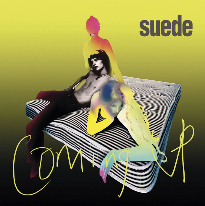
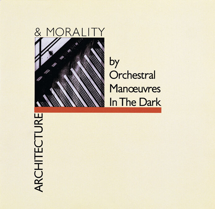
from left: Suede’s ‘Coming Up’, 1996. Art direction by Peter Saville with Brett Anderson. Photography by Nick Knight; Orchestral Manoeuvres in the Dark’s ‘Architecture & Morality’, 1981. Design by Peter Saville and Brett Wickens. Architectural photography by Robin Roddey
Take that cover for Power, Corruption & Lies, a reimagining of Henri Fantin-Latour’s A Basket of Roses. “It kind of legitimised floral painting by virtue of the fact that it was a New Order cover, who were perceived as very cool and directional. By putting that 19th-century oil painting, which is a chocolate box-type painting, onto the cover of a New Order album in 1983, it said this romantic imagery is actually ironically cool.” In 2009, the cover was immortalised as a stamp.
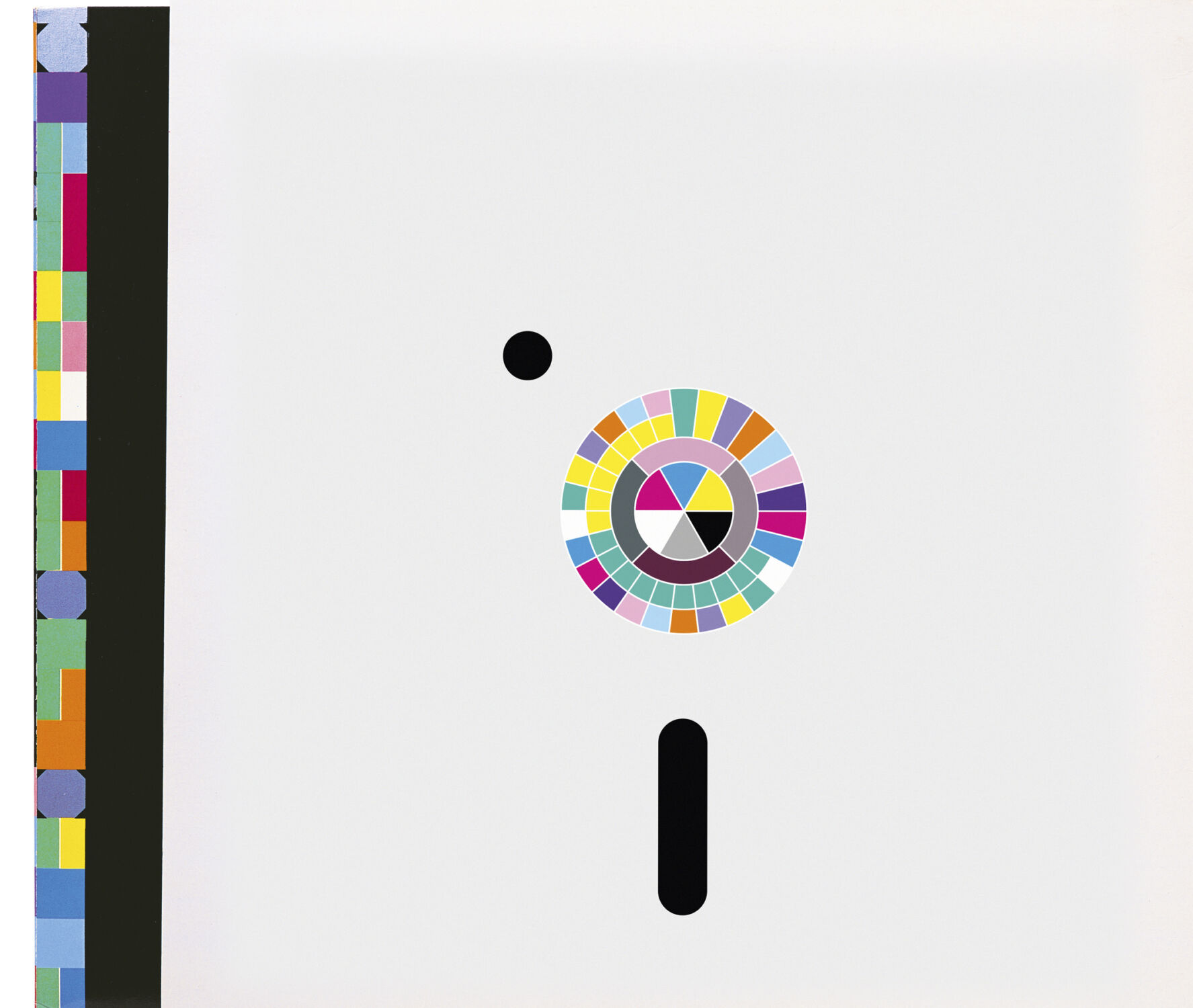
Factory Records was never run like a proper business. New Order’s Blue Monday (1983) single cover, designed to resemble a floppy disk, came printed without the band’s name or the single’s title. Instead, Saville had taken the alphabet and turned it into a colour code that ran up the side (a similar treatment would be applied to the cover of Power, Corruption & Lies). Famously the die-cut sleeve was more expensive to produce than what the record itself cost to buy, meaning the label lost money with every copy that was sold – of course, Blue Monday went on to become the biggest-selling 12” of all time.
“With no disrespect, Tony didn’t have business experience. Nor did Alan, nor really did I. No real record company would’ve released Blue Monday with nothing written on it. But we weren’t doing it to make money. We did it because it felt important. Tony created Factory as an opportunity for people in Manchester, he believed in the new music scene. We had a venue, I did a poster and that was the Factory. And out of that came a record label to be nothing more than a springboard to help people. There was no profit agenda to begin with and there was not a profit agenda for the next 15 years. It was like a kind of arts project – you’d give it the Turner Prize these days.”
(In later years, Saville would increasingly be aligned with the fashion world, collaborating with Dior, Yohji Yamamoto and Burberry, co-founding the visual media platform SHOWstudio with Nick Knight and, most recently, designing a record sleeve for Chanel’s 2023 Manchester show and starring in a Juergen Teller-lensed Ferragamo campaign.)
With his later covers through the ’90s, outside of Factory, Saville was brought in as a consultant art director to help big bands get the covers they wanted, and worked closely with Jarvis Cocker, Bryan Ferry, George Michael in his Wham! days and Suede’s Brett Anderson. “All groups have a hierarchy. Usually the decision-maker of the visuals is the decision-maker of everything.” This wasn’t the case for New Order, who Saville says could “never agree on anything”.
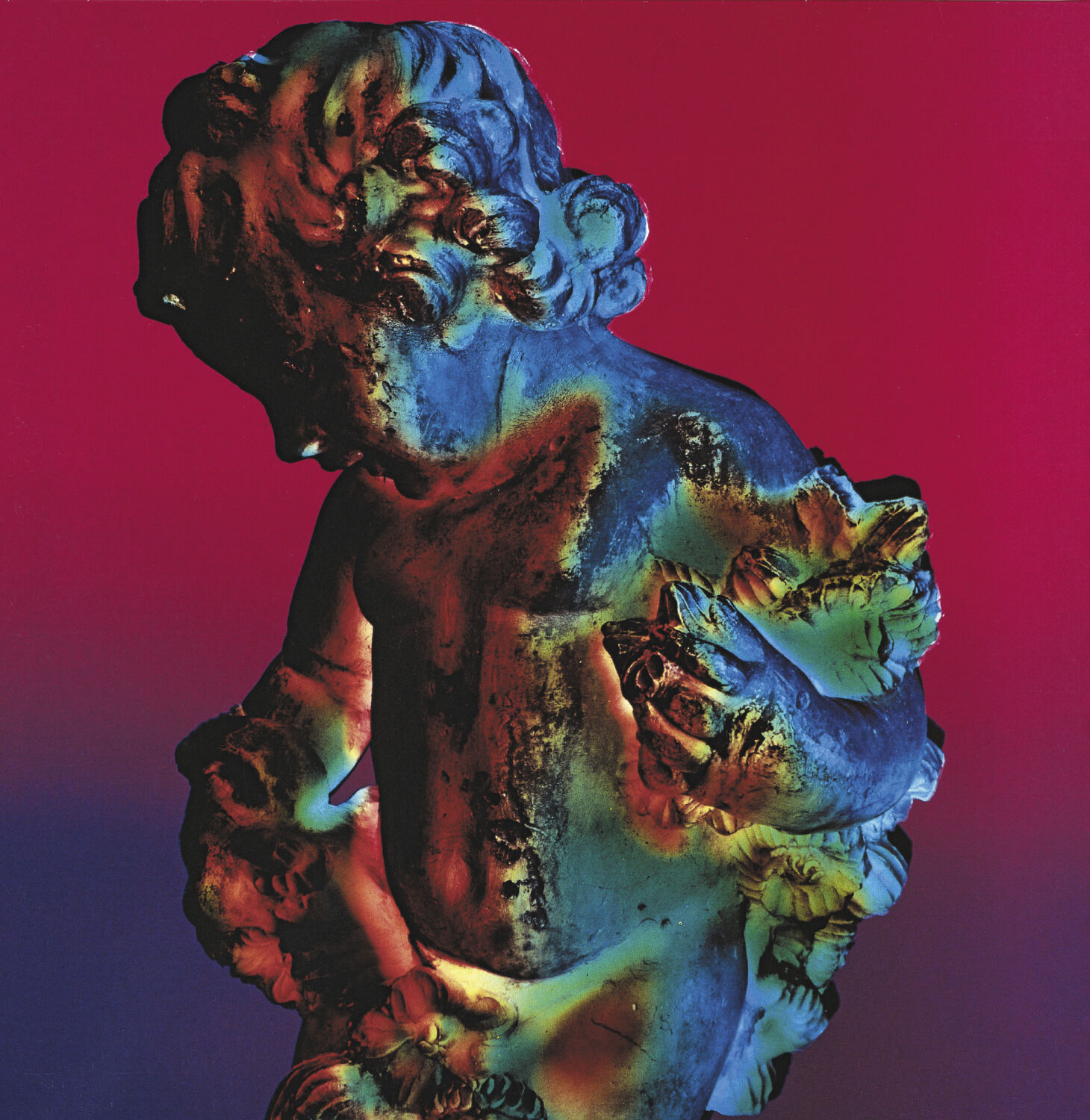
from left: the cover and inside sleeve of New Order’s ‘Power, Corruption & Lies’ on Factory Records, 1983. Design by Peter Saville; New Order’s ‘Technique’ on Factory Records, 1989. Art direction by Peter Saville. Dichromat image by Trevor Key and Peter Saville. Design by Peter Saville Associates. © Peter Saville/New Order
“Exclusively with Factory covers, I made the things I wanted to see in the world around me, in my world. I had the freedom to create without being answerable to anyone, no one approved the work. So I would do the cover and then it would go to the printers.” This meant often the first time the bands would see their album sleeve was when it hit shelves. “New Order never really discussed the record covers,” he says, having revealed to The Guardian in 2011 that when the band discovered the designer had put a picture of drummer Stephen Morris on the cover of 1985’s Low-Life – their only sleeve to feature a band member – they called him a bastard. “This was the nature of the relationship,” he told the paper.
I’m keen to know why Saville thinks these covers are still culturally relevant. “The funny thing about the Factory covers is that they’re very seductive. They don’t care whether you like them or not. They were aloof.” The works have been mined by fashion (Raf Simons dedicated not one, but two collections to Saville’s Factory catalogue), have made their way into galleries and been put on an academic pedestal. In the weeks that preceded our conversation, his friend’s daughter, a graphics student at Kingston University in West London, had been given a lecture on Saville’s work under the banner ‘Postmodernism and Complexity’. Saville had also recently tuned into a Sky Arts documentary where writer Paul Morley, who also grew up in Manchester, referred to his use of typography as “scholarly”.
“There are people I meet now, from far-flung parts of the world, who I would never have predicted would see [the work], or it mean anything to them in their life. I’m like, ‘Fucking hell, how did it get to where you were?’”
In today’s streaming age, he no longer sees album covers as a relevant mode of communication. “We’ve gone from a famine to a feast. The 12” vinyl is a thing again, but it’s among a thousand hip things and 50 million TikTok posts or whatever every day. You’re not going to change the world with a record cover now.” But the pendulum can always swing and, after clueing himself up on Charli xcx’s Brat summer and its infiltration of the US election, there’s a hint of optimism to his voice. “The fact it was an album cover going into the heart of political discourse, it could be the start of something…” A new dawn for record covers, perhaps? Where sleeves can shape creative dialogue, inspiring a new generation in the process? Just like the impact Kraftwerk’s Autobahn had on Saville all those years ago. Just like the impact Saville’s own work has had on the visual world at large.
Portrait by Wolfgang Stahr. Taken from 10 Men Issue 61 – MUSIC, TALENT, CREATIVE – on newsstands now. Order your copy here.


